This week I’m working on a new “Library” device for shows.
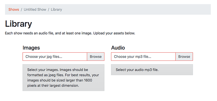
I’ve been struggling with how to best present the image and audio uploading user interface. I’ve settled on it being a two step process, drawing on the way that the “old” desktop-based Soundslides worked … in that you would select your images and audio via separate clicks of a button.
I’ve just released the latest version of the UI.
You can see this new interface if you create a new show.
After selecting your images, you’ll see a button for uploading. This will hopefully resolve some of the confusion reported by some users. There were reports of not knowing where to start when uploading/importing.
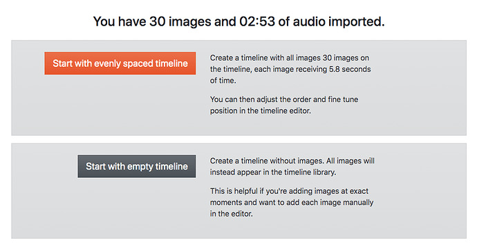
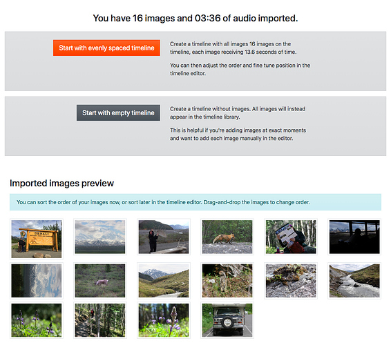
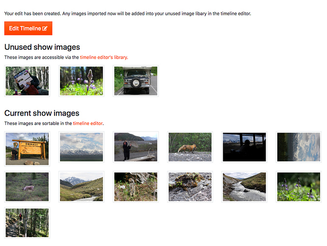
After uploading the assets, there’s a new dialog for starting your timeline edit.
Basically, you have two choices. You can start with a timeline with all your images evenly spaced out. Or you can start with a blank timeline.
Advantages to starting with a timeline with all images evenly spaced out:
- If you’re syncing to music or ambient audio, this might be all you’ll need.
- If you know you want an exact speed (eg, each image gets 4 seconds), then all you need to do is import the correct number of images.
Advantages to starting with an empty timeline:
• If each image should correspond with an exact moment on the timeline, it might be easier to manually insert the images as you listen to the audio in the editor.
- The less “evenly spread” your desired edit is, the more time you’ll save by manually adding the images to your timeline. (To manually add images in the editor, right-click on the thumbnail and select “Insert at current time”)
This is all a bit abstract to explain, so please give it a try and let me know what you think.
I should have another Library-related update by the end of the week.
Thanks!
