It’s been a busy week. After last week’s emphasis on everything-that’s-not-the-timeline-editor, I’ve focused on the timeline editor all week. Specifically, two items.
- An improved layout that works better at multiple screen sizes.
- New Inspectors (project-level, and item-level)
Layout
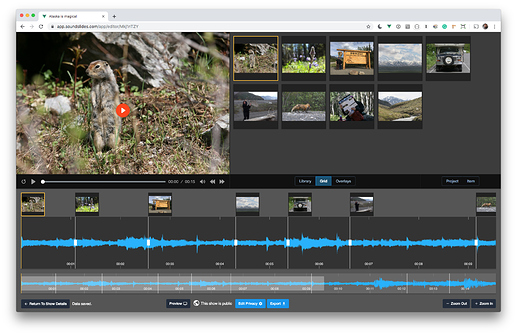
The goals of the new layout were to tighten everything up, and make the dark theme easier on the eyes. The layout is now responsive, rather than requiring you to resize the panels yourself.
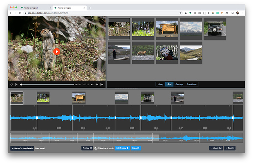
Here’s the same view in the previous design:
New Inspectors
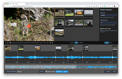
You might notice two additional items in the middle command bar.

Those open into right sidebar inspectors.
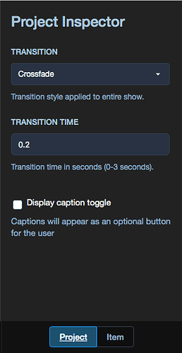
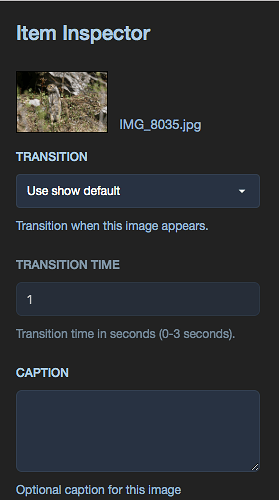
With those inspectors, you can change transitions and other settings.
Project Inspector
Item Inspector
Next steps
The overlay and library panels are next. They’re in dire need of attention. I’m working on the overlay panel now, but it will probably be next week before it is released.
As always, give the new changes a try, and let me know what you think.
Joe
